Help! I'm getting criticism about my website's accessibility. Now what?
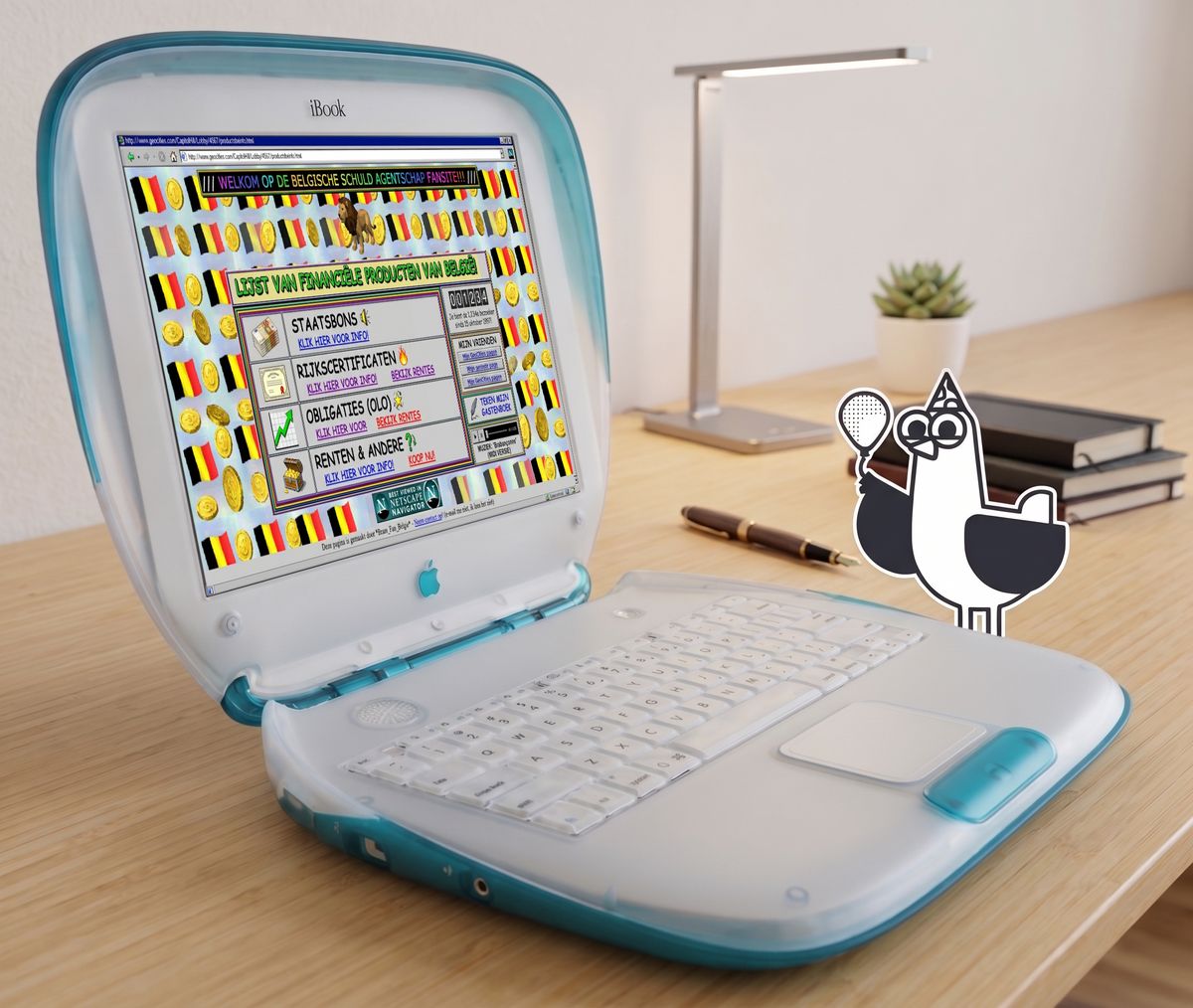
In late August 2026, usability experts said that the website of the Federal Agency of the Debt, where citizens can buy government bonds, is a textbook example of how not to build a website. That criticism wasn't new: three years earlier, the same editorial team had already said the site was outdated. The Agency promised at the time to work on it. Since then, nothing has changed, and there aren't even plans anymore, because the budget is lacking.
On this page
- Who is this article for?
- Step 1: Acknowledge the criticism and find out what it really means
- Step 2: Ensure a clear owner and a realistic budget
- Step 3: The accessibility statement
- Step 4: Don't fall into the trap of "let's just build a new website"
- Step 5: Make the ordered information genuinely accessible too
- Step 6: Make images and video accessible too
- Step 7: Make sure it lasts, so the criticism doesn't come back
- In short
- Need help with the execution?
This example is the trigger for this article, but the problem is universal. Whoever is responsible for a government website, or for the website of an organization with a public-interest task, will sooner or later get criticism about its accessibility or usability. The question isn't whether that happens, but what you do about it.
We don't want this article to simply point fingers. A website that isn't accessible is unfortunate, but criticism without concrete advice gets no one anywhere. Hence this step-by-step plan: a concrete approach for anyone who wants to get to work on it. We're happy to make our expertise available to any organization that wants to take this step.
Who is this article for?
For whoever within an organization is the first to be confronted with that criticism or has to solve it: a communications manager, a website manager, an IT manager, or a digital-services policy officer. In short: anyone who, the moment the criticism arrives, has to decide what actually happens next.
Step 1: Acknowledge the criticism and find out what it really means
Find out what the criticism concretely means for your users:
- Gather all reports (press, customer service, user research, accessibility complaints) in one place.
- Translate every report into a user who gets stuck, not into a technical term. "The screen reader doesn't read out the numbers" becomes: "a blind user can't find the information he needs to make a decision." (A screen reader is a program that reads the text on a screen aloud.)
- Be honest about the damage: people who drop off, a weaker image, and in some cases a legal rule that isn't being followed.
Step 2: Ensure a clear owner and a realistic budget
Criticism rarely leads to change on its own. Someone has to actually act on it. It's important that one specific person is designated as the owner.
Who is that? And what does this person need to do?
- One clear owner who is allowed to make the final calls.
- First determine everything that needs to happen, based on what you found in step 1, before you set a budget. Freeing up budget without that assessment is groping in the dark:
- Too little, and you can't carry out your plan.
- Too much, and you lose credibility with whoever has to approve the budget.
- Ask for a short, rough estimate for this (for example from an external agency or your own team): what does it roughly cost to organize the information, make the site technically accessible, and maintain this afterward? Such an estimate doesn't need to be perfect yet.
- Make sure the budget isn't tied only to a one-off event. Maintaining a service belongs in the regular budget, not in that of a new request.
- A concrete deadline for a first, visible improvement, even if it's just one step from this plan.
Why this comes first: without an owner and a realistic budget, every following point stalls at "good idea, but there's no money."
Step 3: The accessibility statement
Now that you've determined who is responsible and what exactly is going wrong, you're ready to draw up an accessibility statement.
It's a document stating:
- to what extent your website is accessible,
- which parts are (still) not, and
- who is responsible for improvement.
In short, it's a summary of steps 1 and 2. You share what's going wrong and who is responsible for tackling this problem. In this statement you also indicate how people can give feedback.
If you don't have a statement yet, draw one up first using our fill-in assistant for accessibility statements. If you already have one, use it as a starting point.
For many government and public websites, an accessibility statement is legally required.
Step 4: Don't fall into the trap of "let's just build a new website"
This is the most important pitfall, and the point where most projects go wrong. As soon as there's a budget and an owner, the first instinct is almost always: "let's build a completely new website."
Why is this a trap?
- A new website builds on the same underlying messy information.
- It's the most expensive and slowest route, while the biggest gains are often elsewhere.
- It pushes the real cause down the road instead of solving it.
What actually needs to happen first:
- Bring order to the existing information. Before a single screen is designed: what does a user need to know, in what order, and why is it currently placed where it is?
- Have someone with an overview sort out that mess. Someone who can bring together all the scattered information (pages, PDFs, forms) into one clear order, regardless of what it currently looks like.
- Only then build a simple website that supports this information. The website exists to carry the information, not to show itself off.
The rule of thumb: the information matters more than how pretty the website looks. A simple site with clear, accessible, well-ordered content works better than a beautiful site that isn't accessible. Accessibility and usability come first from day one here, not as something you tack on afterward.
This doesn't mean a new website is never needed. Sometimes the technical foundation is so outdated that there's no other way. But that then follows from ordering the information — it's never the starting point.
Who does this? Bringing order to information is a field of its own. Involve a capable person as the first step in the process, and make sure accessibility is already part of the thinking from that very first step.
Step 5: Make the ordered information genuinely accessible too
With a good information structure, you're already in a strong position. Now that information also needs to be reachable for everyone.
- Can someone using a screen reader, who can't use a mouse, or who has poor vision, find the information needed to make a decision — and just as quickly as anyone else?
- Walk through the user's entire journey from start to finish (for example: finding information, logging in, completing an application), not each part in isolation.
- Test filling in forms specifically on a smartphone, since that's where many people start, and where patience runs out fastest.
- Rewrite internal, difficult terms into language the user understands.
Step 6: Make images and video accessible too
Images and video are often addressed last (or never), even though they can either remove barriers or make them bigger.
- Never put important data (figures, conditions, results) only as text inside an image. Put it in readable, searchable text.
- For explainer videos, provide a voiceover or spoken description of what's happening, not just visuals with text on them.
- Use imagery that's recognizable and relevant, not random stock photos that have nothing to do with the content.
- Provide subtitles and transcripts. This helps not only people who are deaf, but also, for example, people sitting in a train's quiet carriage.
Step 7: Make sure it lasts, so the criticism doesn't come back
The costliest mistake is rarely the website itself. It's often how new pages get created afterward. Accessibility isn't just in the code — it's often also in the content that gets published.
- Plan a recurring accessibility check (at least every year), independent of incidents or media attention.
- Make accessibility and a clear structure a standard part of every future update, not something added on afterward.
- Make sure the content management system can't be misused, and provide training to the people responsible for the site's content.
- Write down who is responsible for what, so the process doesn't stall when someone changes roles.
In short
- Acknowledge & investigate: really know what's going wrong and for whom
- Owner & budget: make sure someone can act
- Accessibility statement: record what you know and who's responsible
- Order first, then build: bring order to the information before you rebuild
- Accessible information & journey: make sure everyone can find the info, from start to finish
- Accessible images and video: make multimedia usable for everyone too
- Make it last: prevent the criticism from coming back
Need help with the execution?
Eleven Ways specializes in digital accessibility. We go beyond simply meeting the rules. From technical accessibility to testing the full user journey to following up on it long-term: we guide organizations so that accessibility doesn't stay a checkbox on a list, but becomes the starting point.
Latest articles
-
Bingo! Do you recognize these excuses about accessibility?
"Someone who is blind doesn't need our website anyway, right?" Anyone who has ever worked on a web project has definitely heard this sentence (or a variant of it) before. Usually in a meeting, usually right at the moment accessibility finally made it onto the agenda.
-
Accessibility Statement Generator
An accessibility audit has been completed, and the next question is: “What exactly needs to be included in the accessibility statement?” For specialists who run checks every day, that may feel routine, but drafting a statement is something many people still struggle with.


Popular articles
- Accessibility Statement Generator
- Tooltips that work for everyone
- Star raters are more challenging to make accessible than you might think
- Fixing digital accessibility issues with the press of a button: too good to be true?
- Combined 50 years of accessibility expertise: an expert interview
- More than half of Belgian government websites have no accessibility statement
How can we help your organisation?
-
Mail your question : info@elevenways.be -
Call us : +32 (0)78 079 111